
Data is essential in every business setup. It helps you understand your customers, manage inventory, and make better decisions. However, it is only as good as you represent it. Massive data with little presentation makes it difficult or impossible to decipher. Data visualization is a critical step to ensure better data management and utilization.
Data modernization involves employing new technologies to collect, store, and represent data. It also encompasses analyzing and visualizing data to make it more impactful and insightful. Here are five tips to help you modernize your data visualization for better decision-making.
1. Incorporate AI and Machine Learning
ML and AI make the two most significant tech buzzwords of the past few years. Analytics has become more comfortable and accurate with these technologies. AI can help you detect patterns in your data that you may have missed earlier. Machine learning can automatically improve visualizations based on feedback and other interactions.
Managing enterprise data can be a hefty undertaking when you rely on legacy systems. AI-powered data visualization tools can help you detect issues and problems with your data setup. You can quickly make necessary changes without spending too much time on data management.
Also, you can employ data visualization services for better management. Working with BI and Analytics experts can help you take your data game up a notch. They will improve your metadata analysis, data quality management, and data governance processes to unmask hidden opportunities. You can also focus on your company’s core competencies while professionals handle your data needs.
2. Adopt a Cloud-First Approach

Cloud computing has taken over the internet in recent years. It offers a better way to manage and represent data. Cloud-based data visualization tools are more scalable and allow for better collaboration. Also, relaying information is faster than on-premises data solutions. That makes it easier for businesses to make better and quicker decisions.
Remember to consider your data visualization needs when migrating to the cloud. Not every solution will work for you. Some may not be available in a cloud version. Determine what you need before switching. Ensure your investment will help improve your data visualization process and make it more efficient.
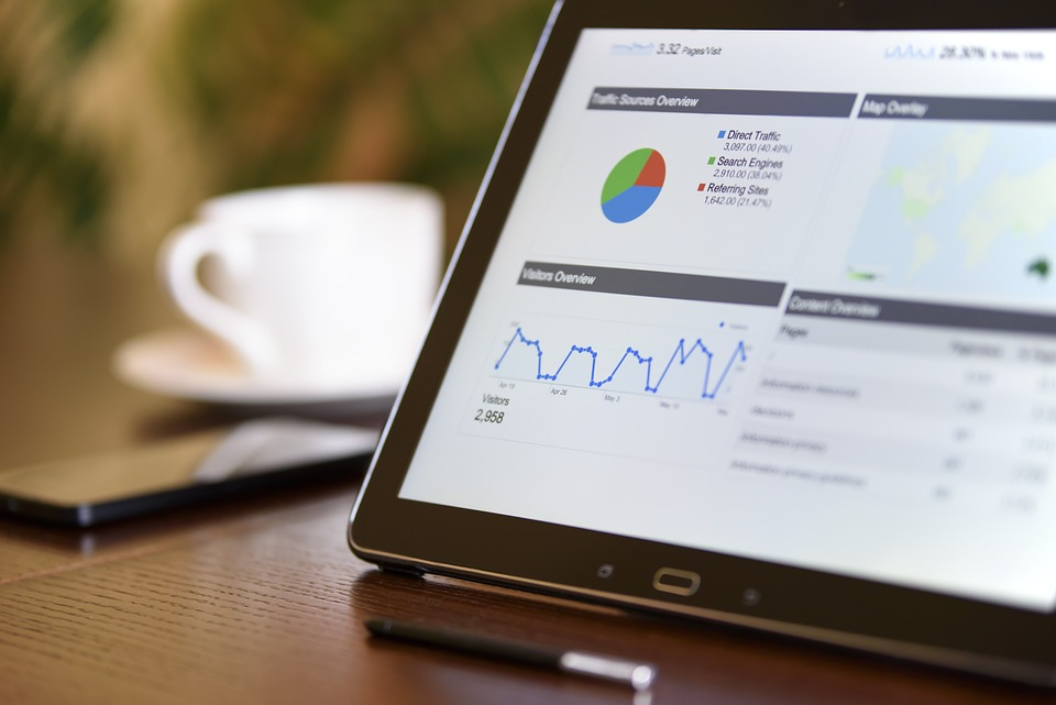
3. Use Interactive Charts
You can present your data in various forms. Line graphs, pie charts, bar charts, and heat maps are some of the most popular. However, they may not be the best way to engage your audience. All they do is show how many items are in each category. It means a user must click back to select another property to compare.
Interactive charts are a more engaging way to represent your data. They allow users to select what they want to compare and how they want to see it. The data changes based on the user’s interactions, making it more dynamic. For example, you can click on a point on prices to see how it compares to the average over time.
Interactive charts are not only more engaging but also more informative. Users can select the data they want to see, making it easier to decipher. When working with massive data sets, it can be challenging to find what you want. Interactive charts make it more comfortable to find and compare the desired information.
4. Add Context to Your Data

Context is the frame of reference to elaborate something better. In data visualization, context is the information that surrounds your data. It helps users understand what they are viewing relative to other data aspects. Also, the context makes it easy to make decisions instead of going back for reference on another dashboard.
Various data visualization contexts can help your audience understand what they are viewing. For example, you can use a geographical context to show how data changes over time or space. Contexts in commodity prices can refer to the previous values to show the changes in the past 24 hours, one hour, or even a month.
Indicators like percentage change, amount, or currency can add context to your data. It would help if you considered those that work best for your audience and data sets. For instance, marketers want to know the leads that became conversions and how much the conversion rate changed.
5. Eliminate Clutter and Junk
Some data representations include information that may not benefit the audience. For example, in a bar chart, you may have several bars next to each other with very little difference in size. In such a case, you can reduce them and have a single bar for all the categories with similar values.
When developing data visualizations, think about what information will help users make decisions. Also, consider how you will present the data for easy consumption. Creating a data-rich environment with too much information can be overwhelming to users. Make it simple and only represent the essential information.
Summing Up
Data helps businesses better manage their operations, but it only provides value when used correctly. Modernizing data visualization helps reduce the time to make decisions, especially when working with massive data sets. The tips above can help create your information more engaging and informative. Ensure you use the right tools to represent your data and make it easy for users to find what they need.