Despite the impact of social media, emails remain an essential means of communication for companies. Companies use emails for needs such as marketing, internal communication, communicating with external stakeholders, and other needs. A well-designed email is significant for communicating the right message to the audience and ensuring they read your content.
Email design is critical for grabbing the audience’s attention to ensure they read the entire email without ignoring the contents. There are various ways to create an attractive email design; however, some guidelines will be necessary to ensure you use the right design and enjoy the impacts based on email purpose.
1. Using Email Design Templates
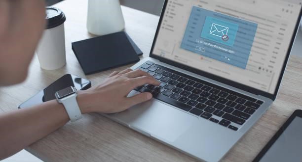
One of the best ways to have the best email design is to use different email templates from various brands and companies. You cannot use any temperate format; you should select the designs based on your preferences and the purpose of the emails. The templates can also help you when you have no ideas how to create the best email design or are unsure of the strategy to use for the email purpose.
You can use different design templates from Klaviyo email design; they provide all email designs for business, marketing, branding, internal communication, and other needs. You can use the Klaviyo automation tool to customize the email content and other elements to include. You can view and modify the prototype until you have the best final copy to share with your audience.
2. The Use of Background Images
Background images can have some aesthetic value in your emails hence the need to have one, especially when promoting a brand. The image should match the product and the brand you are promoting to help provide some visual information. It can also be the critical identification and a factor to differentiate genuine emails from you and scammers. When using the images, you need to follow some rules:
The image should not be too bright or use a brighter color that will affect text visibility. It should lay below the text and ensure the font color is not affected by the images. Secondly, use the pictures sparingly; you cannot use more than one image for an email. The image should be consistent throughout the email, i.e., it should be of the same size, font, and other attributes.
3. Selecting the Layout
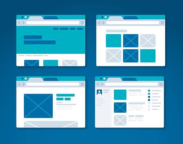
The email layout is significant in determining how the audience will view it. First, you must ensure the layout is visible and appropriate for all devices, phones, PCs, and tablets. Designing an email only for PCs will make it difficult for those using mobile phones to view the contents and open the email fully.
The best layout should be portrait to fit on mobile and PC screens without discriminating against mobiles. Single column layout will be suitable for both devices. When using the multi-column, it is best to target PC users, especially employees or official office communication, since all can access PCs. The other layout aspect you should consider is using texts and fonts that can be opened and visible for all devices.
4. Text-to-image Ratio
Sometimes the image-to-text ratio is critical for ensuring a balance when creating an email design. Sometimes, you need to include some images in your email; hence you need to balance the text: image ratio. Using too many images makes your email suspicious and likely to be treated as spam. The rule is to ensure an image on every page the let the rest be explanatory text.
The text volume should also be considerate and only focus on writing essential details. When you use more than one image on a page, ensure there is text between them. This will be essential for writing guideline emails, especially for electronic usage.
5. Creating a Unique Subject Line
Most people are likely to open their emails based on the subject line hence the need to have a unique and catchy subject line to attract the audience to open the email and view the contents. One thing to note is that using capital letters and Bolden texts will not likely make the subject line catchy, and so will using different font colors.
One way to make it catchy is to use other items, such as question marks and exclamation marks. Use a few words to avoid lengthy and perhaps dull subject lines. Create some value or suspense that makes one wish and desire to open the email. The other strategy is to make the subject line a sentence summary of email content. The subject line design is significant for services such as marketing hence the need to get it right.
6. Personalizing the Emails
One of the ideal ways to ensure your email design is catchy is to make the audience feel the image is tailored for them. Personalize different email elements, including the subject line, header, signature, images, and other elements.
Personalization is critical for creating a bond with the clients and showing them how much you care for their needs. It can help marketers retain clients, making them feel valued and a greater part of the business community. While personalizing, you should be sensitive toward groups and cultures. If you are unsure about the color or item usage, it is best to go for a universal, neutral, yet attractive design.

Conclusion
A good email design should focus on the email purposes the select the best template to match the intended needs. While designing the emails, you should focus more on the subject line, fonts, headers, use of images, and the right text-to-image balance.
